linkedin
behance


Hi! My name is Daria and I am a UX/UI designer. I’ve been creating user-friendly and minimalistic user interfaces for several years now. My mission is to make users' interaction with technology more intuitive, comfortable and inspiring! (I agree, that’s a pretty good =)).
social media
html, css
mobile app
product design
marketing
graphic design
communication design
UX
no code web development
animation
Since my youth, I’ve paid attention to the usability and accessibility of web interfaces and apps and now I’m involved in designing and building them. I know how to work with large amounts of data, design systems, I am familiar with iOS and Android guides and UI-kits. I work in the product team in conjunction with CPO, marketing department and developers. All our work processes are built according to MVP system, all decisions are made on the basis of UX-research, based on user needs and minimal costs for the business. I will be glad to work with you!
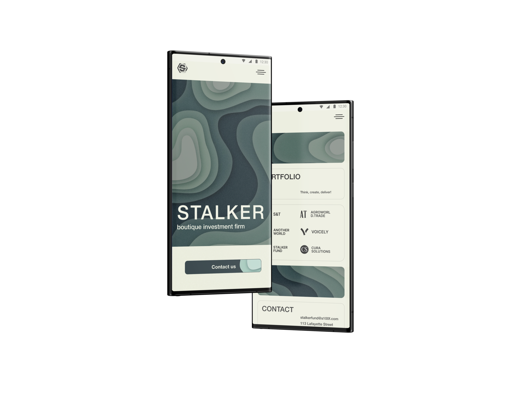
Mobile version of the site is under development
works
UX/UI, graphic design, seo, web development, product approach
figma
tilda
adobe illustrator
adobe photoshop
UX/UI,
product approach
product approach
figma
figma
UX/UI, graphic design, seo, web development, product approach
figma
UX/UI, graphic design, seo, web development, product approach
figma
adobe photoshop
figma
adobe photoshop
adobe illustrator
tilda
figma
UX/UI, graphic design, web development
figma
UX/UI,
graphic design
graphic design
figma
adobe photoshop
adobe illustrator
figma
adobe photoshop
tilda
figma

View the project
View the project
View the project
View the project
View the project
View the project


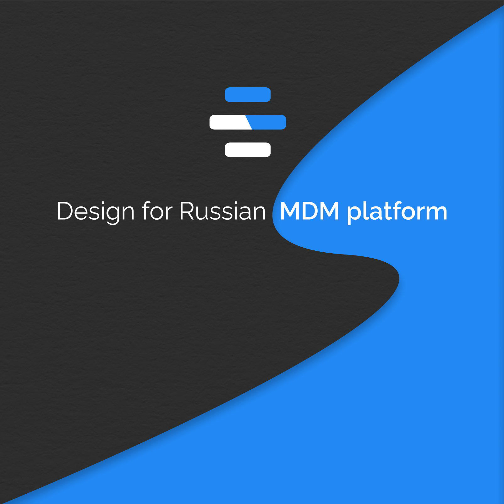
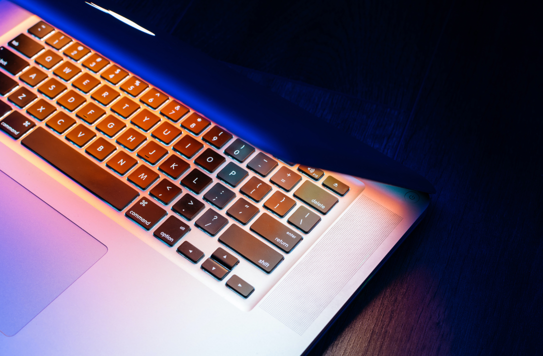
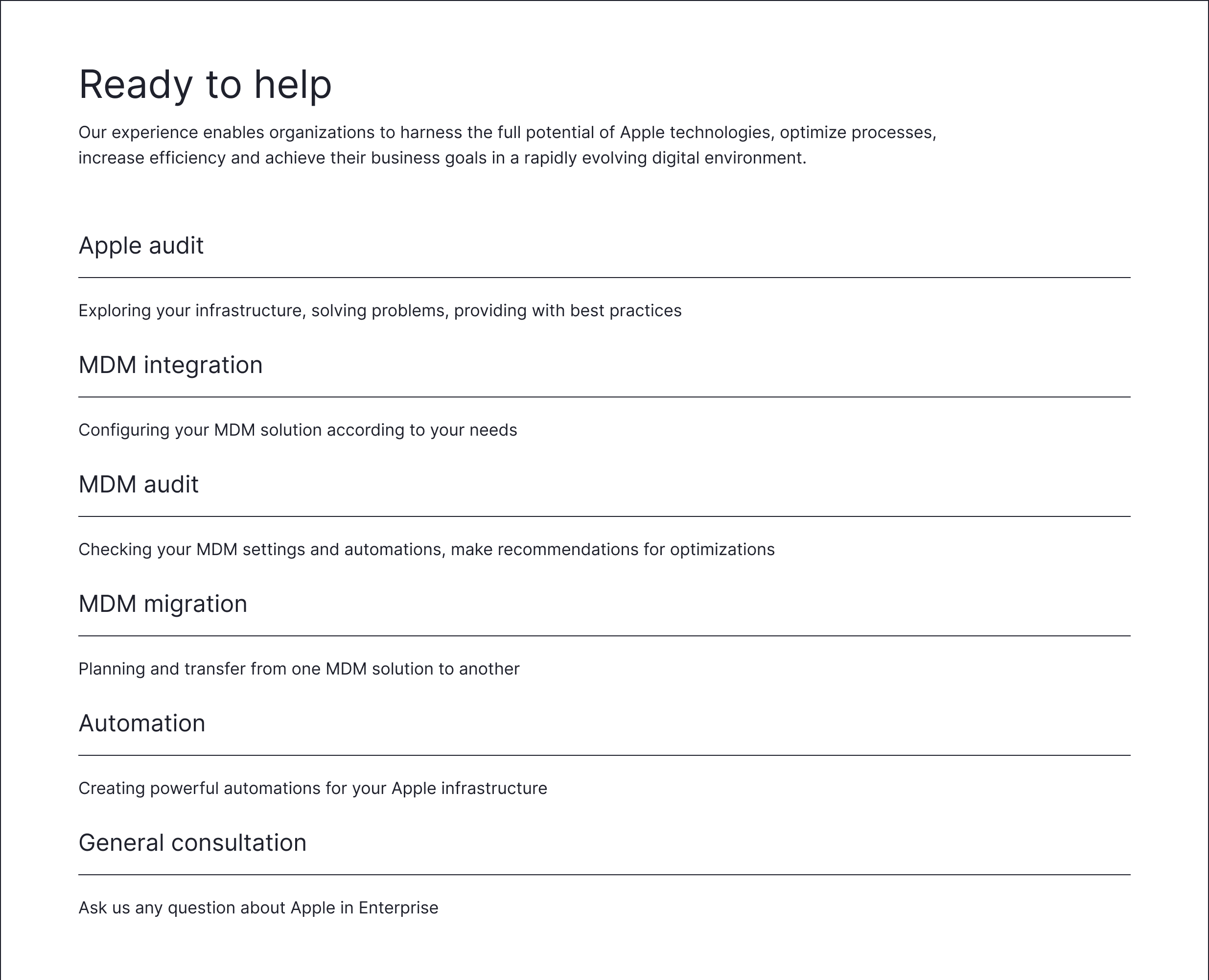
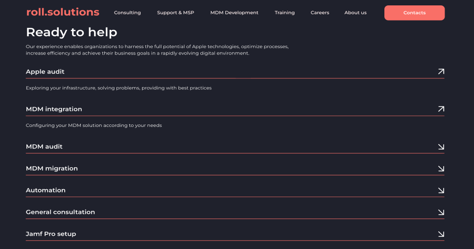
Ringo is an innovative Russian Mobile Device Management (MDM) service specifically designed for efficient management of Apple devices in corporate environments. It provides a high standard of security, flexibility in configuration and ease of use, making the process of managing Apple devices in companies as efficient as possible.
Hypotheses
This service was invented several years ago by a team of developers who were involved in the implementation of mdm systems in companies. The services used were not perfect and the developers received a lot of feedback from users, which allowed them to identify customer pains and opportunities for creating and developing their own MDM platform.
Since the company used a product approach, we really needed feedback from users, information about the difficulties in using ready-made mdm solutions, their needs. The MVP model was taken as a basis, we had to think through and implement minimal branding and a set of platform features, gradually improving the design and internal structure of the product.
The compiled MVP map focused on basic functionality that would ensure the MDM platform would work and demonstrate key benefits.
Based on our goals, we created a backlog where we defined task timelines for all teams, set deadlines and calculated work time.
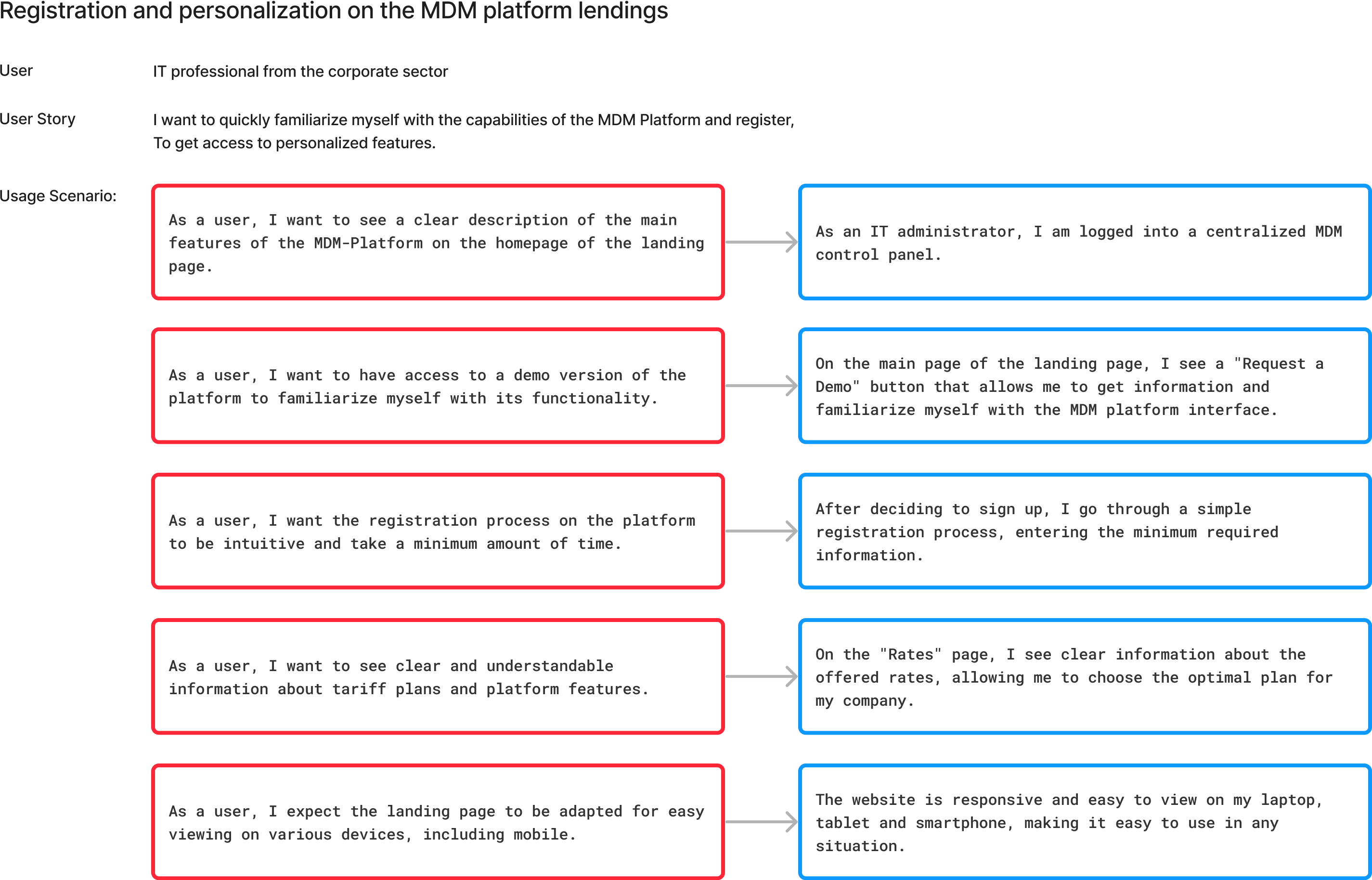
We also described User Stories for all goals, defined user requirements for the product.
And, of course, we made a Customer Journey Map, visualizing the customer’s paths, goals, emotions, barriers.
And, of course, we made a Customer Journey Map, visualizing the customer’s paths, goals, emotions, barriers.
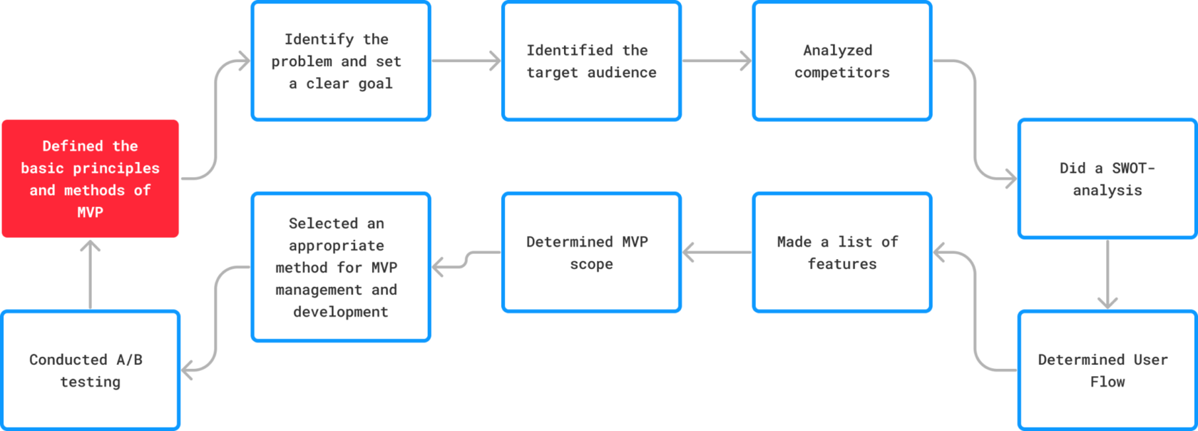
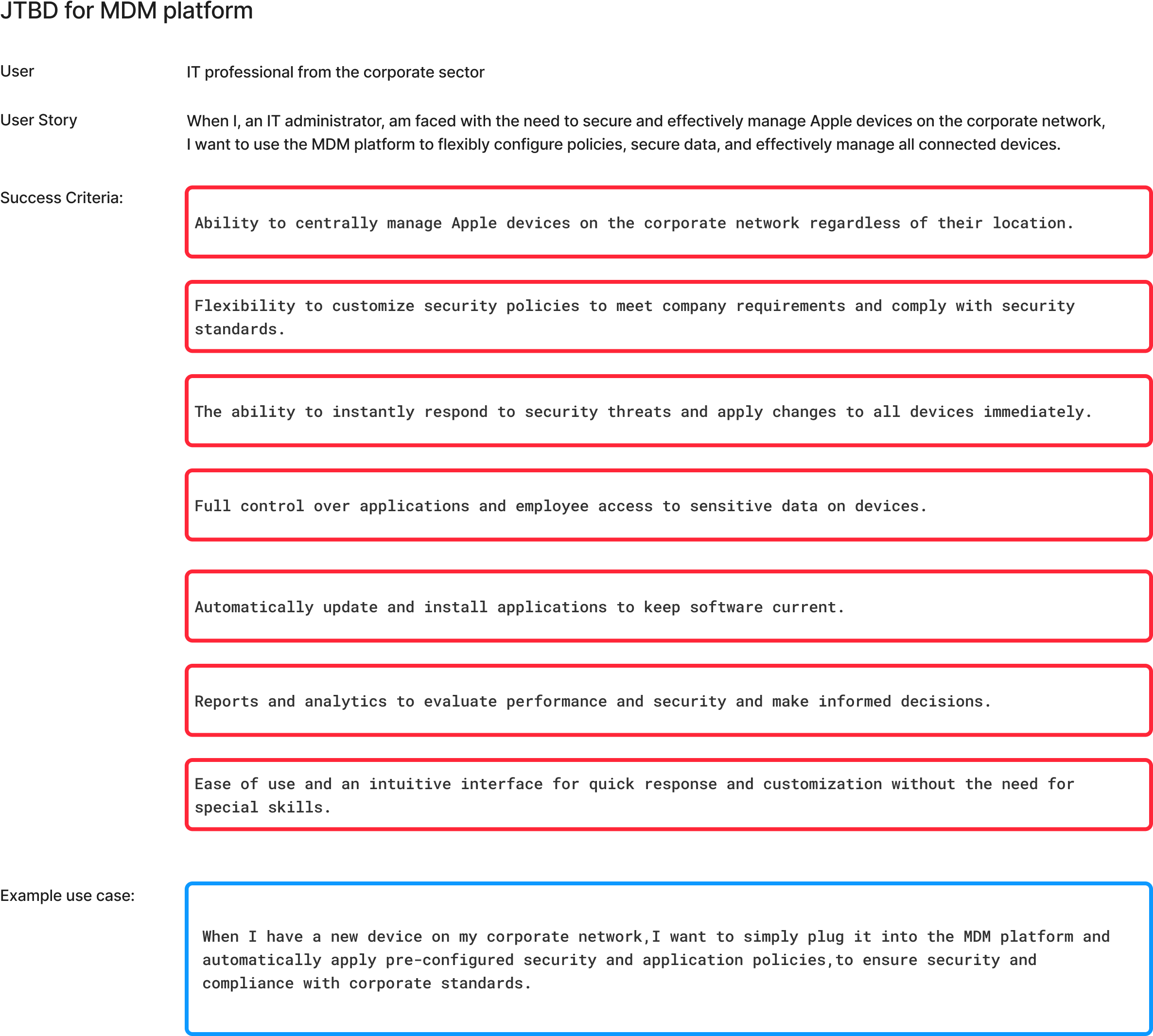
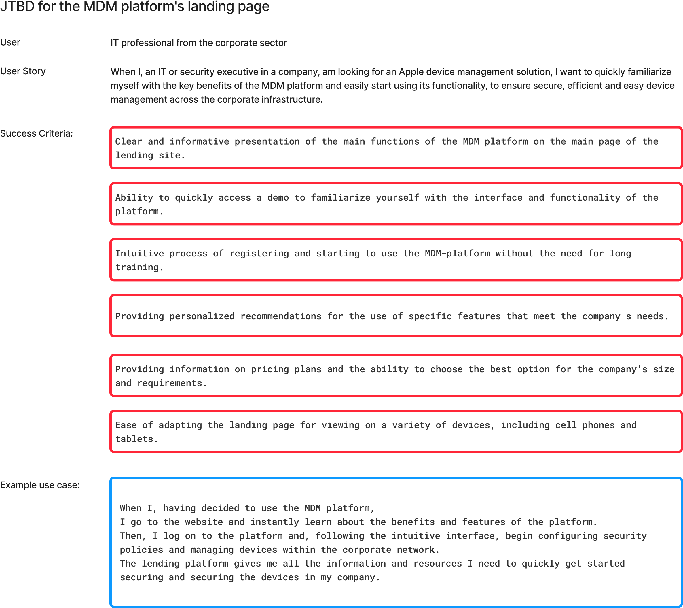
We needed to identify the real challenges and needs of IT administrators and security officers in managing Apple devices.
The JTBD method provided us with an understanding of what key features and capabilities should be included in the MDM platform, identify areas where the platform can add the most value and where to focus our main efforts in creating an interface and functionality that best meets user needs, and create realistic scenarios for using the MDM platform. We did not use the persona method in this project.


In this project I worked in conjunction with the CPO and product team of developers, designers, analysts and marketers. I developed the visual design of interfaces and communications, and participated in basic UX testing.
MVP map
The next step was to create a strong and recognisable brand that communicates effectively with the target audience and stands out from the competition.
One of the MVP goals was to create a visual identity design: styles and templates for visual elements such as logo, promotional materials, website and social media. Prepared design materials for various communication channels, including social media, print materials and emails.


The first thing we started to design was the logo. It had to be easily transformable, typographic and minimalistic. We developed 17 variants of the logo in English, later the logo was transformed into Russian. We also decided on the main colours of the brand.
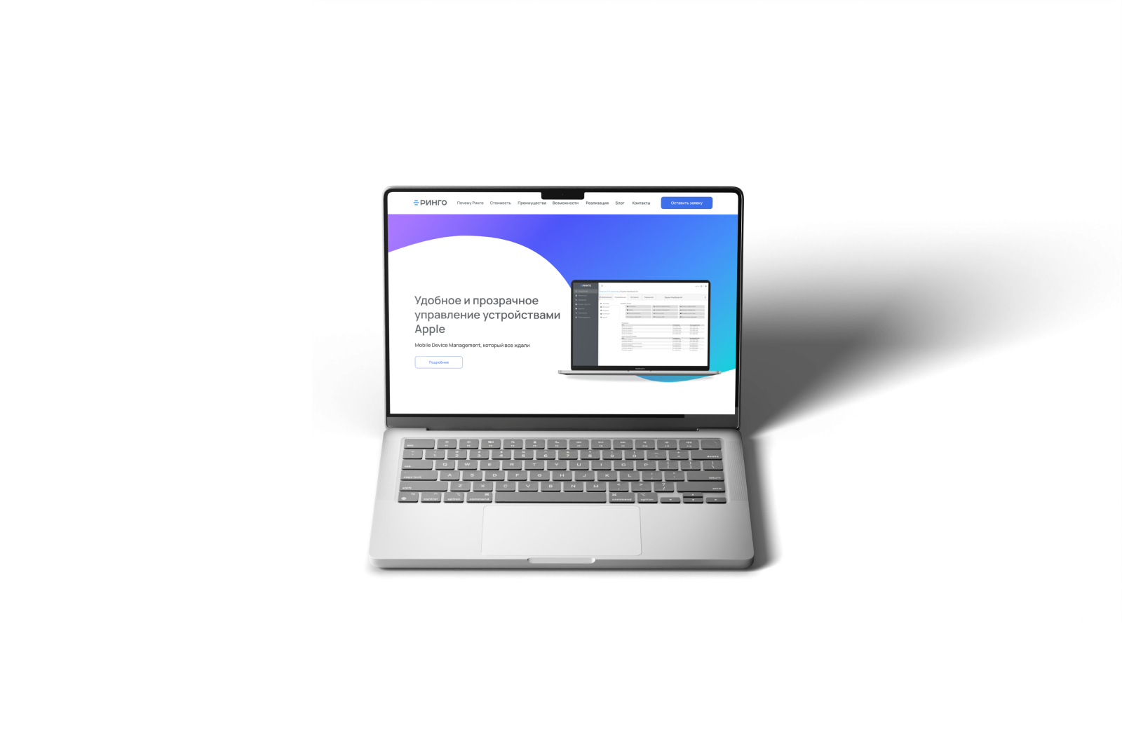
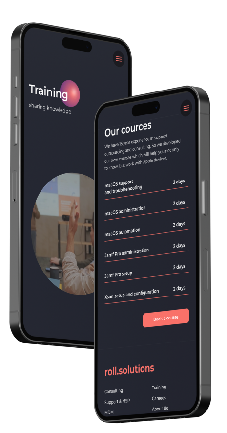
We also started to develop a landing page, which would become a prototype of our website. Based on the target audience's requirements, we created a minimalistic landing page with full SEO customisation. We have achieved that in the search results our site began to occupy the first line in the queries "Russian mdm-systems Apple", "Russian mdm". The conversion rate of the site is currently over 4%.
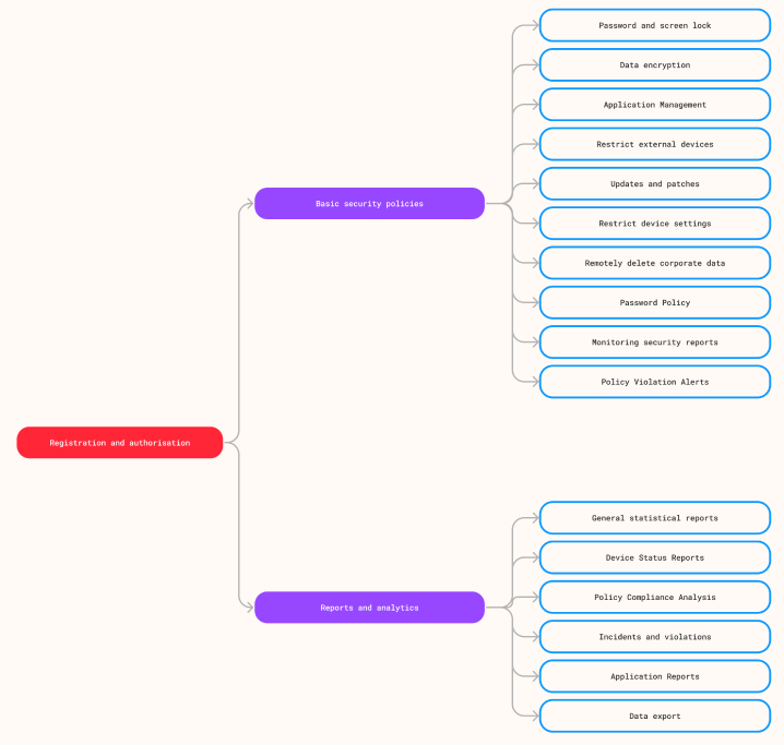
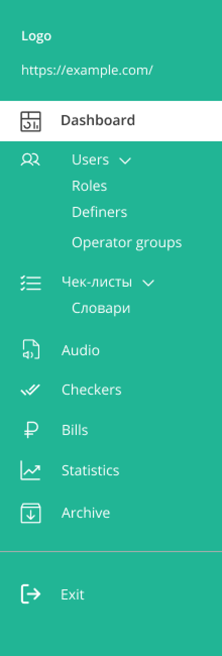
The next step was the creation of the platform's information architecture. Earlier, we developed the minimum structure, defined blocks and necessary widgets. We also established a logical sequence and interrelationships between the data.
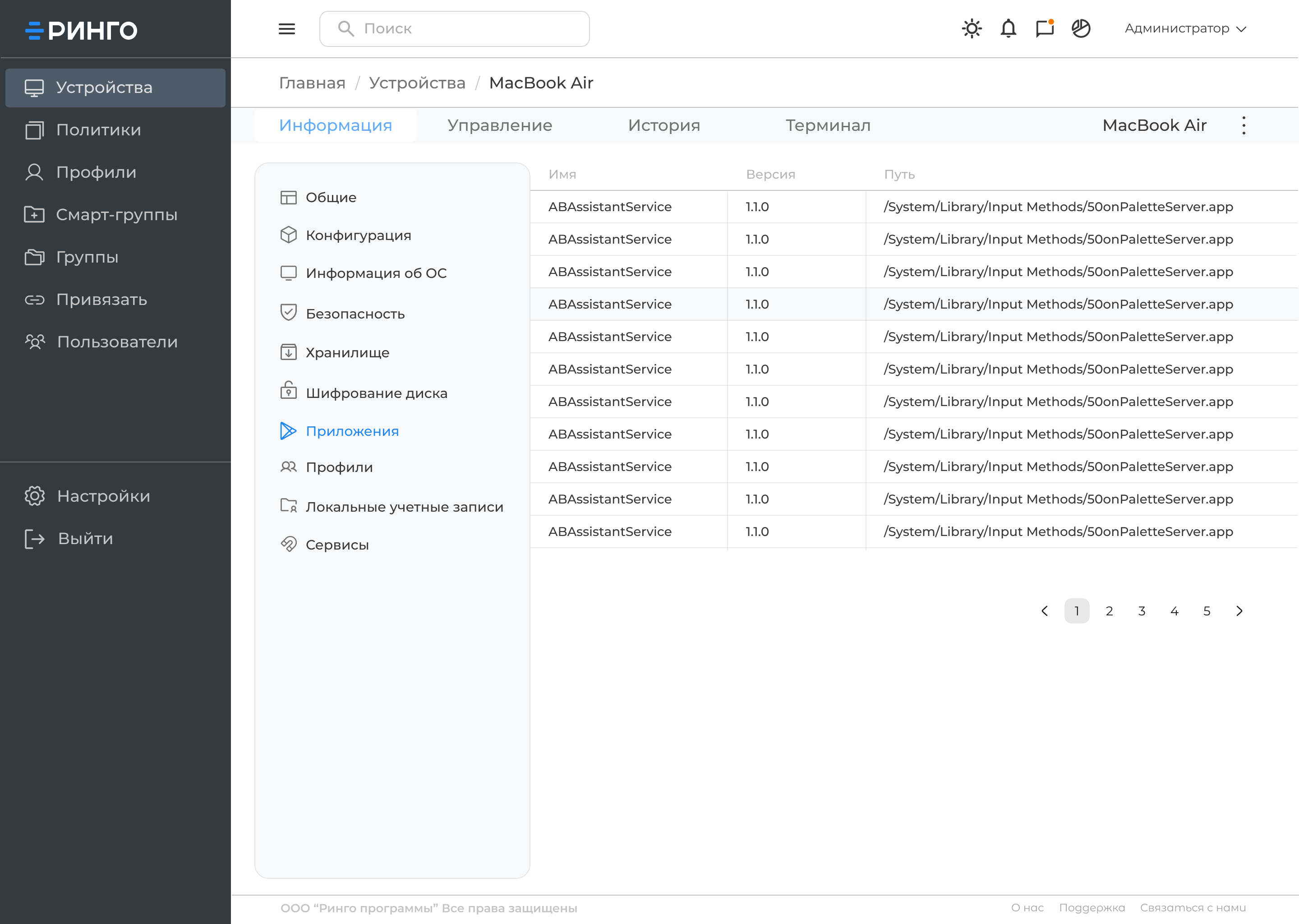
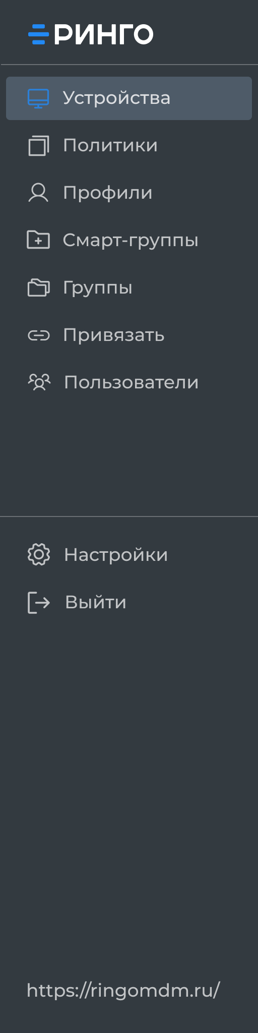
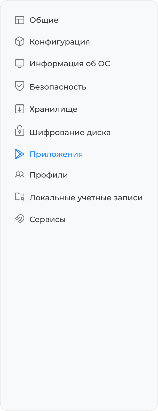
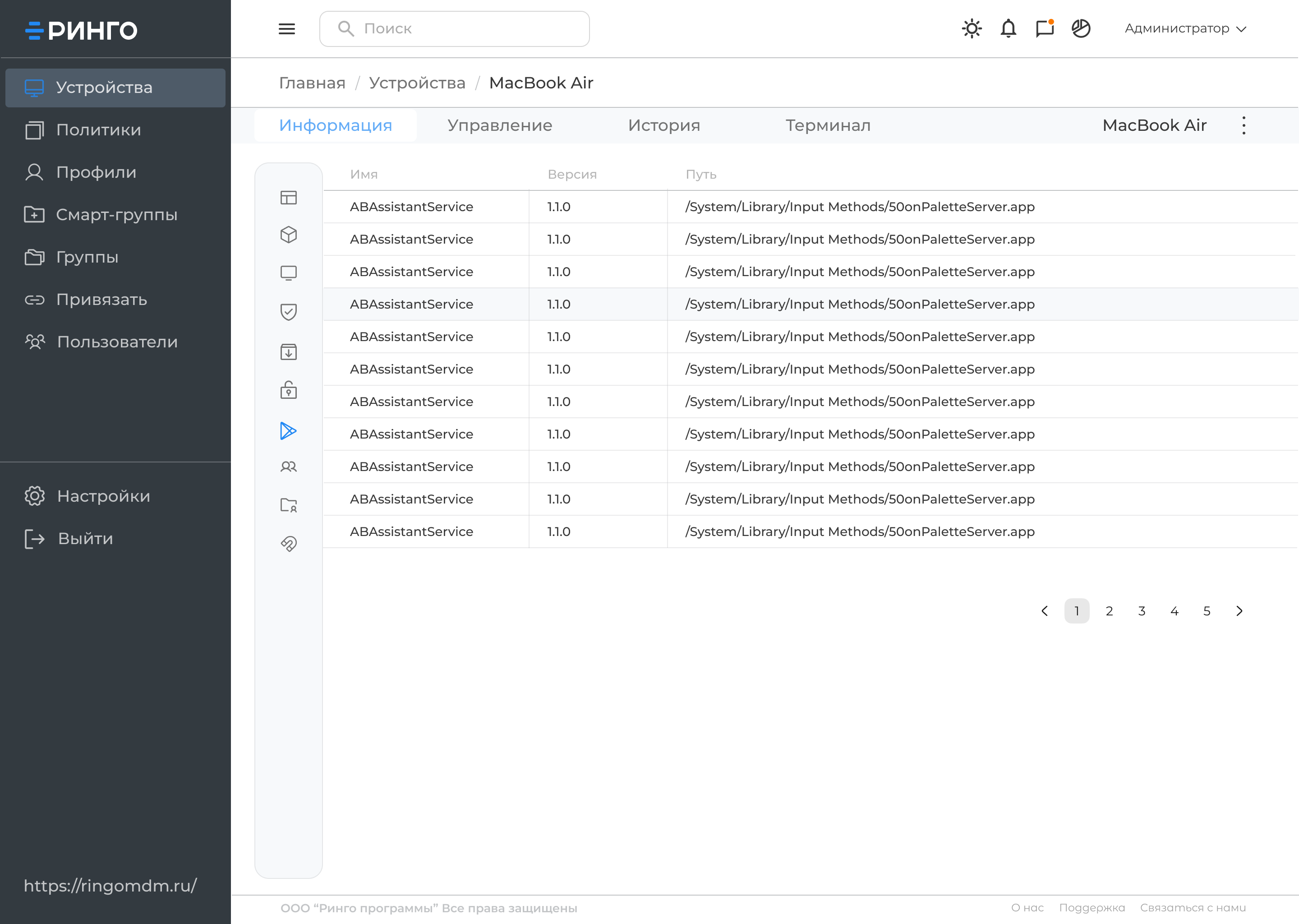
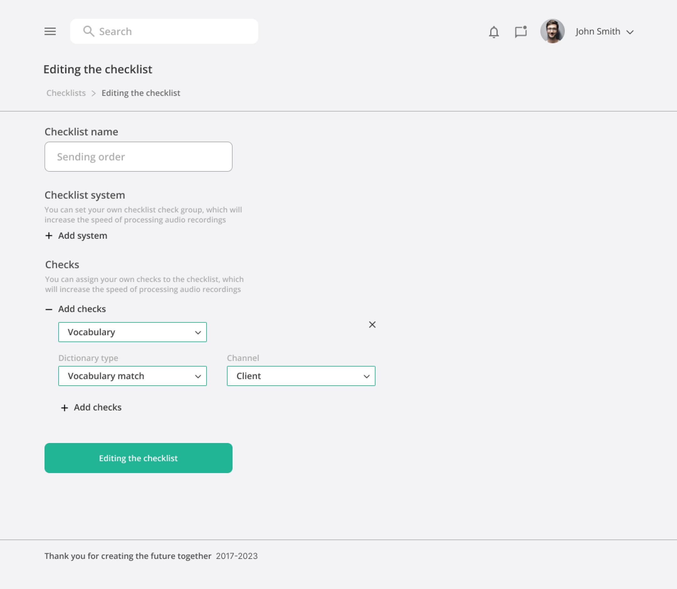
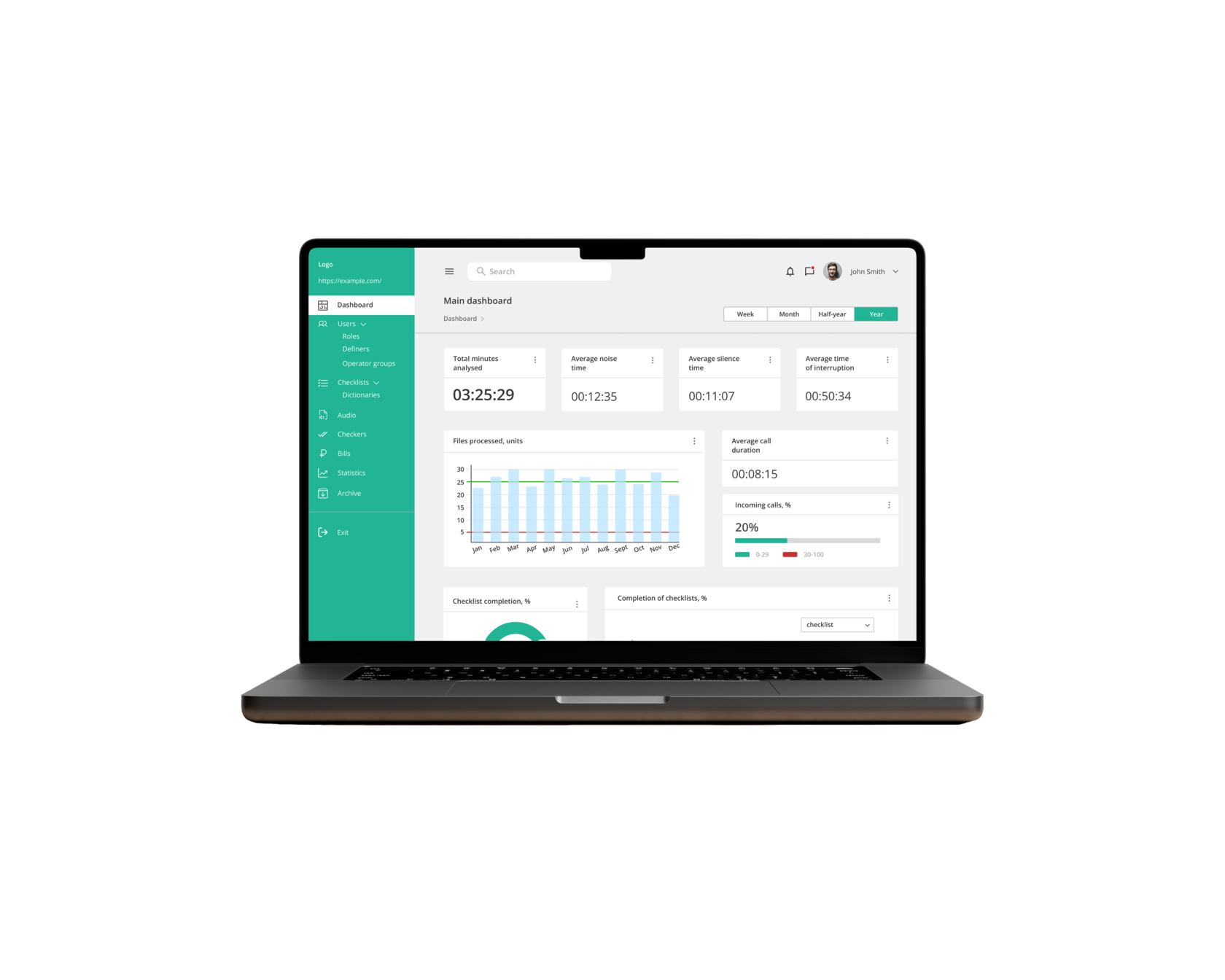
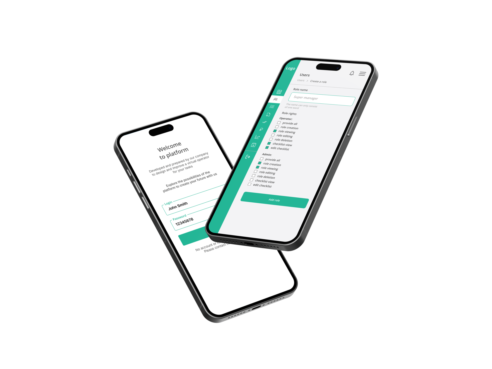
We developed wireframes. Coordinated the structure and data placement with the development team and the customer. And at the next stage we created full-fledged prototypes of the product, taking into account the brandbook and visual identity. I prepared design options for the panel screens, as well as estimation of the realisation timeframe.


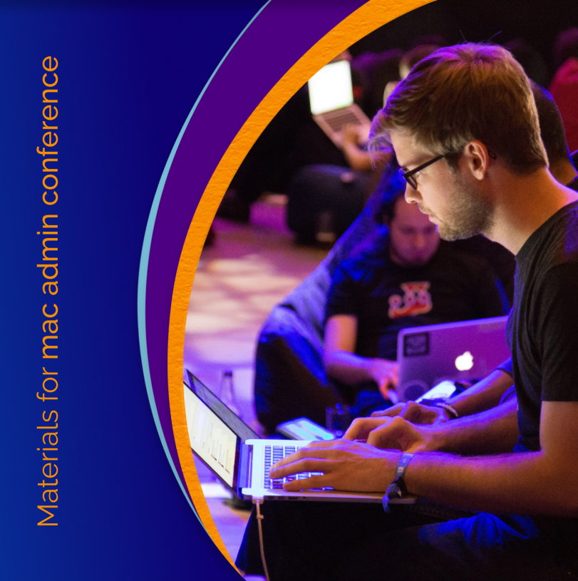
The company annually takes part in a conference for system administrators, thanks to which we received a lot of feedback about the product and the features we would like to implement in the future. It was decided to add an instruction section to the website, which would allow our users to quickly access the necessary materials without requesting them from the support team. And, of course, based on the feedback, we got ideas for the development of the platform itself.
The next stage in product development was the optimisation stage. Taking into account the fact that all new functions appear in the system based on feedback, we decided to use the ready-made Gravity UI design system to optimise the design process and to work out the screens of the administrative panel on its basis.
Work on the project continues.
Site
01
Strategy and MVP
02
Product backlog
03
JTBD
04

Branding
05
Design process
06
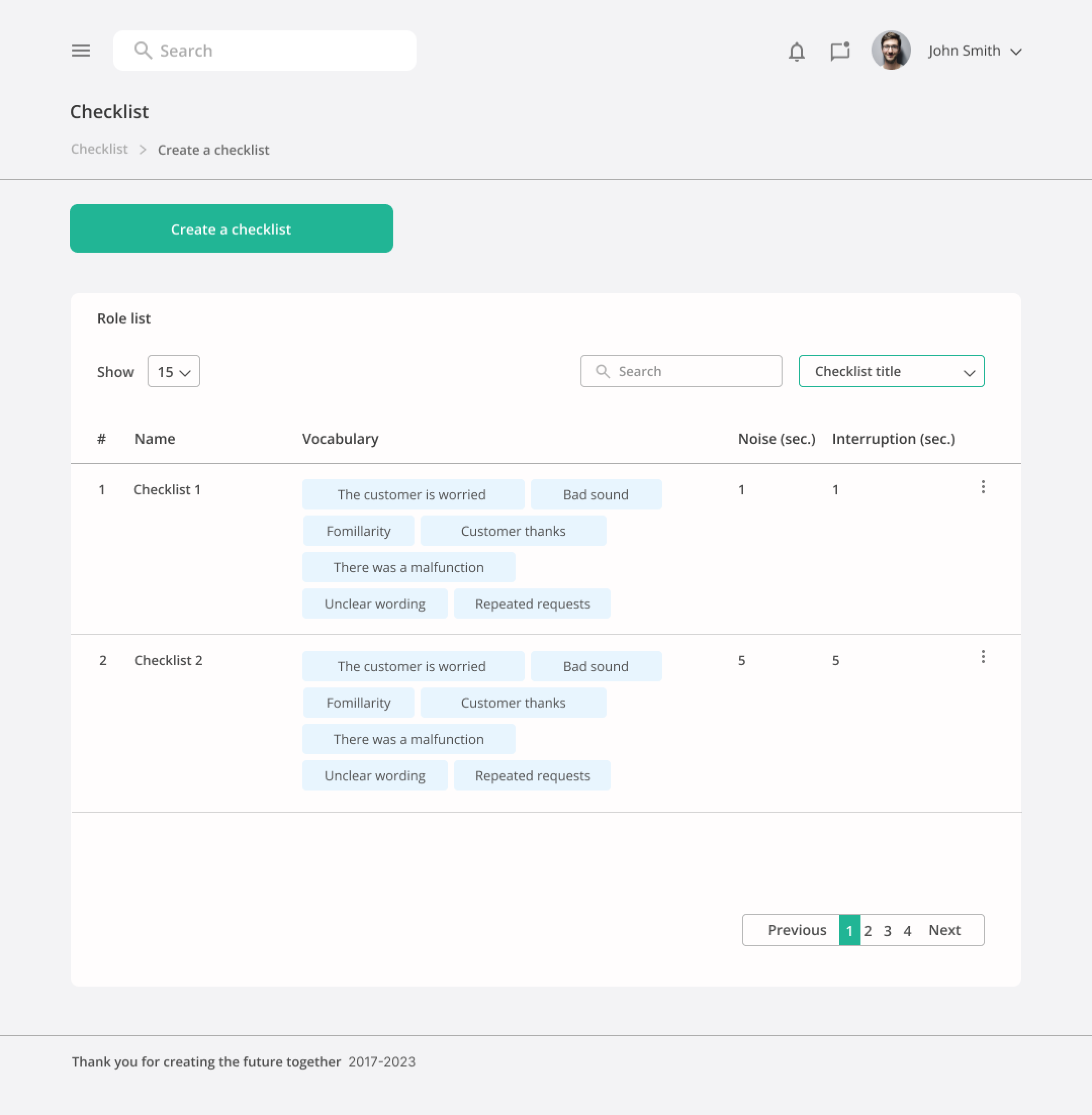
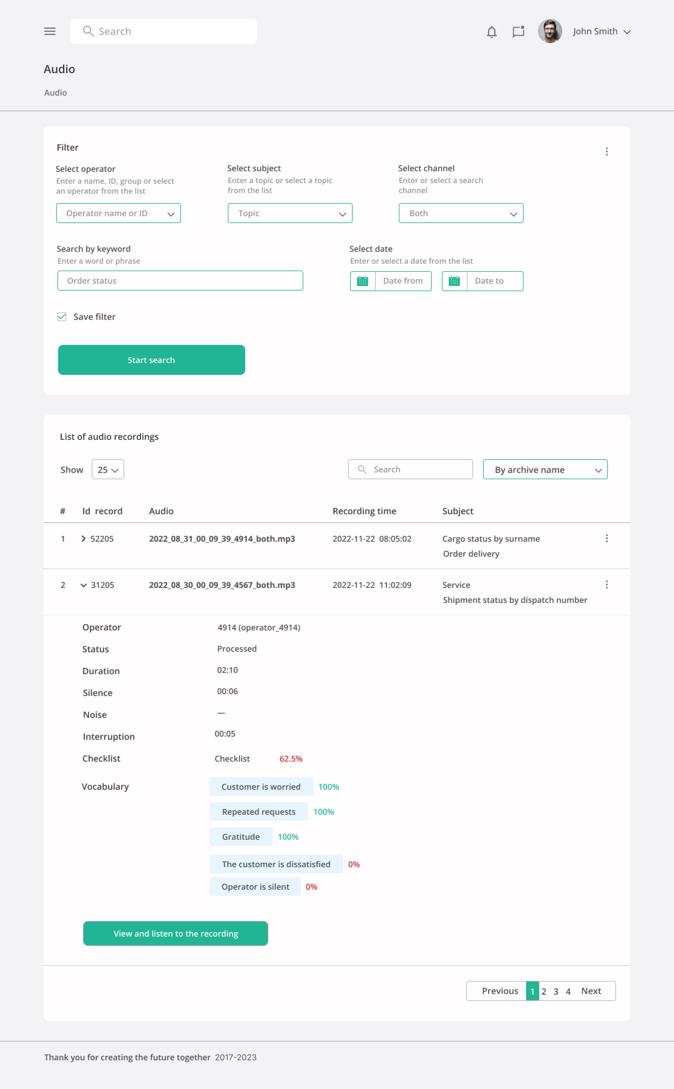
Administrative panel design
07
Administrative panel design
08


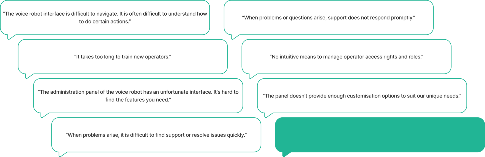
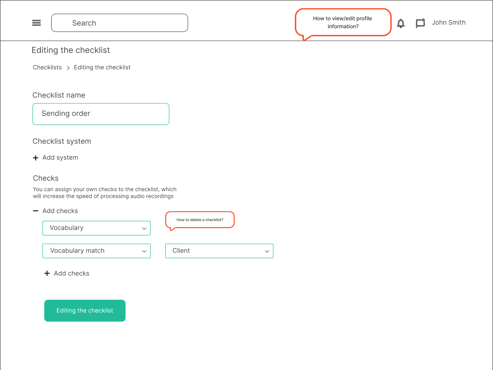
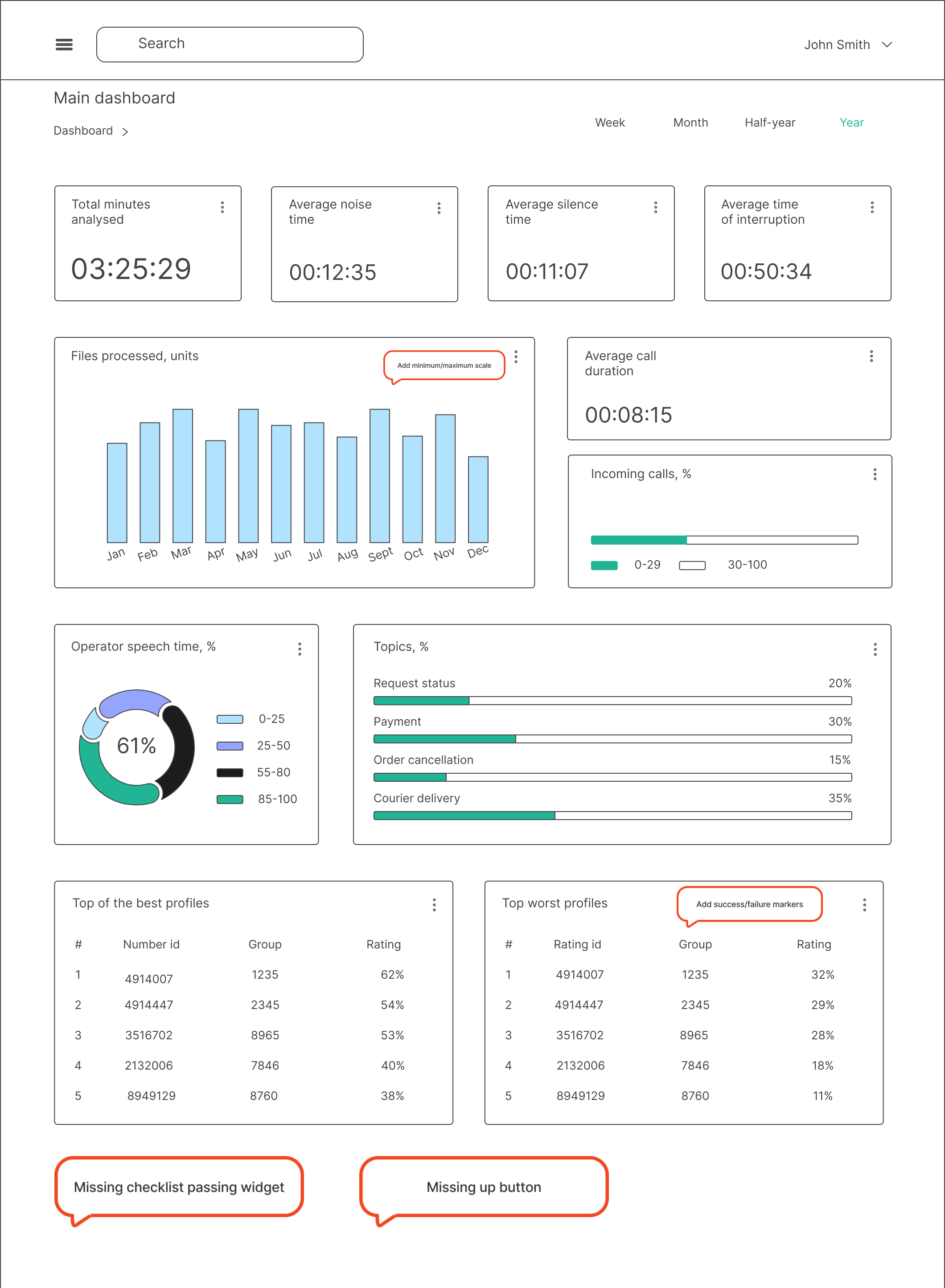
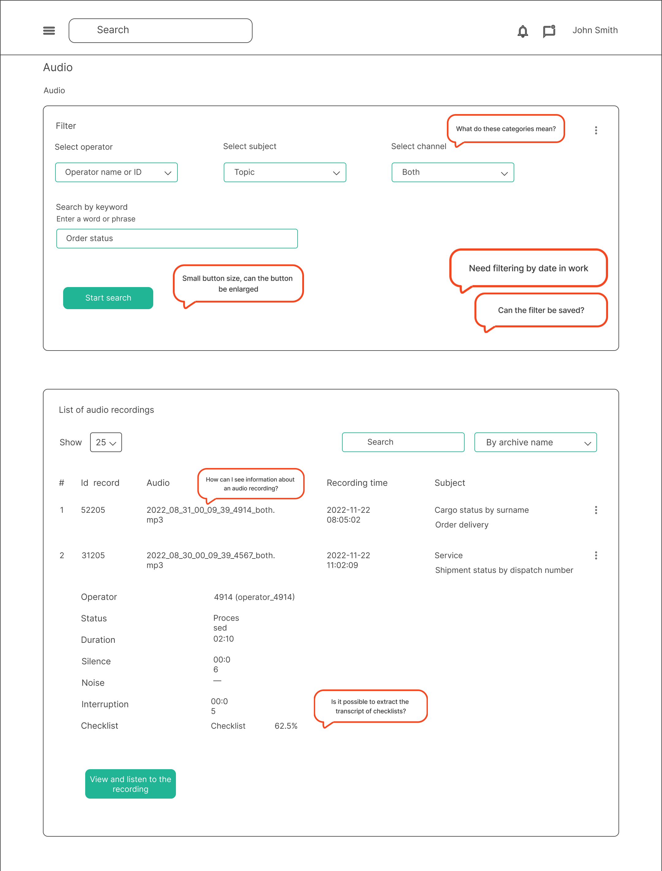
I received the task of design audit of the administration panel of a voice robot for call centres. The panel was initially developed in parts, by different programmers, without taking into account accessibility and understandability for users. Therefore, the product received a lot of negative feedback from existing users, as well as refusals to cooperate due to the complexity of use and overloaded interface.
Goal
I was required to do a design audit of the administrative panel and redesign it. The goal was to make the administration panel more functional, user-friendly and adaptive to business needs, thus ensuring increased productivity and business efficiency. The redesign had to build on the developers' capabilities and, of course, user feedback.
Based on feedback, we needed to determine which design solutions would be best for solving specific user problems or issues.
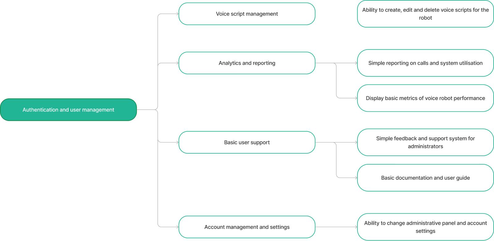
MVP map
01
Hypothesis testing
02


We needed to generate mvp maps for the features requiring redesign first, based on which we could create prototypes for testing. By collecting a few variations of the prototypes each we were able to conduct testing amongst the development team and user interviews with clients.

Work on the project continues.

Based on the obtained results, we made the necessary changes in the structure of the administrative panel. We also improved the interface design and worked out the mobile version of the platform.
Design
03
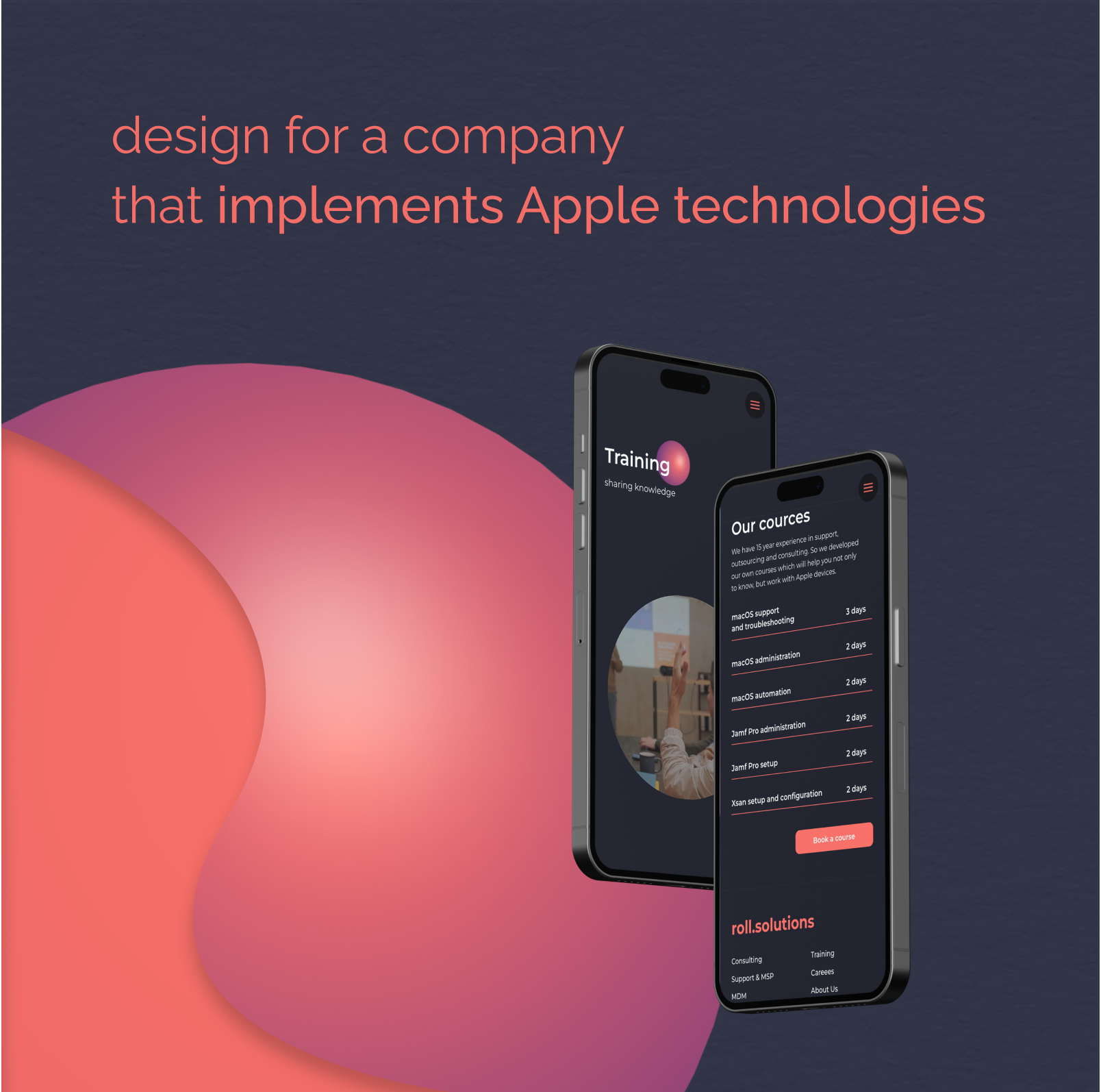
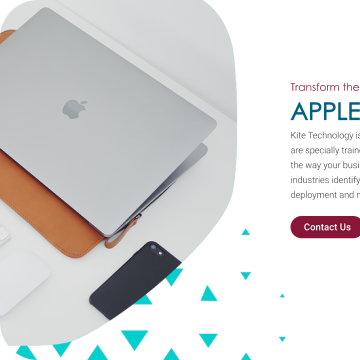
I was tasked with designing and implementing a new website for an apple technology company. The customer already had a site, but since the company has been dealing with the product since 2008, the site was definitely outdated and did not contain all areas of activity.
Research
The next step was to determine the main messages the site should convey and the goals. We planned the structure of the site, identifying the main sections and functional elements.
01
Strategy
02
Design
03

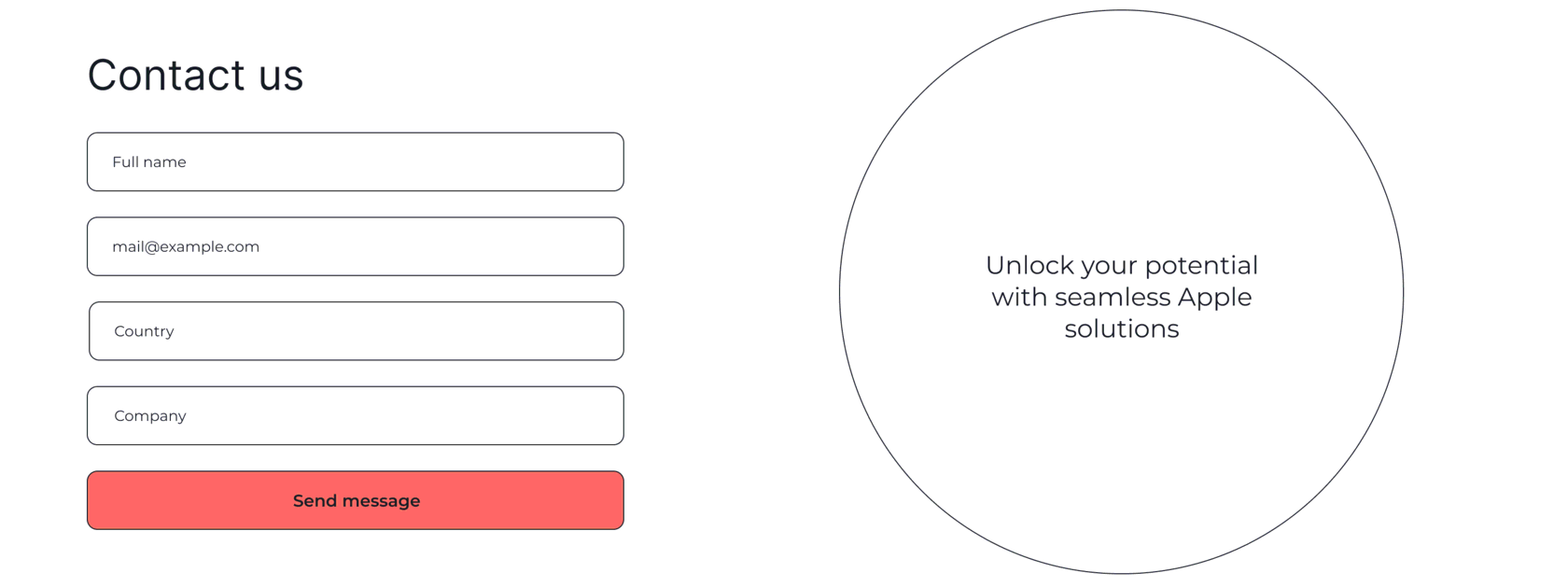
Feedback forms were discussed separately — three types of forms for different sections were designed to make it easier and faster for the user to submit a request.
After approving the structure, we started creating prototypes, choosing the background of the main page, and also decided to add geometric shapes to our site. We chose a sphere that suits the company’s naming and is associated with harmony, plasticity and support.


To solve the task was given 1 two-week sprints of basic time and 1 sprint to finalise the site. MVP-target was a simple understandable site with the main activities of the company and different feedback forms.
We worked on the brief, identified direct competitors and defined a reference list. The company already had a text logo and accent colour, and the client insisted on using Montserrat font.


Competitors
References
Colours, font and logo

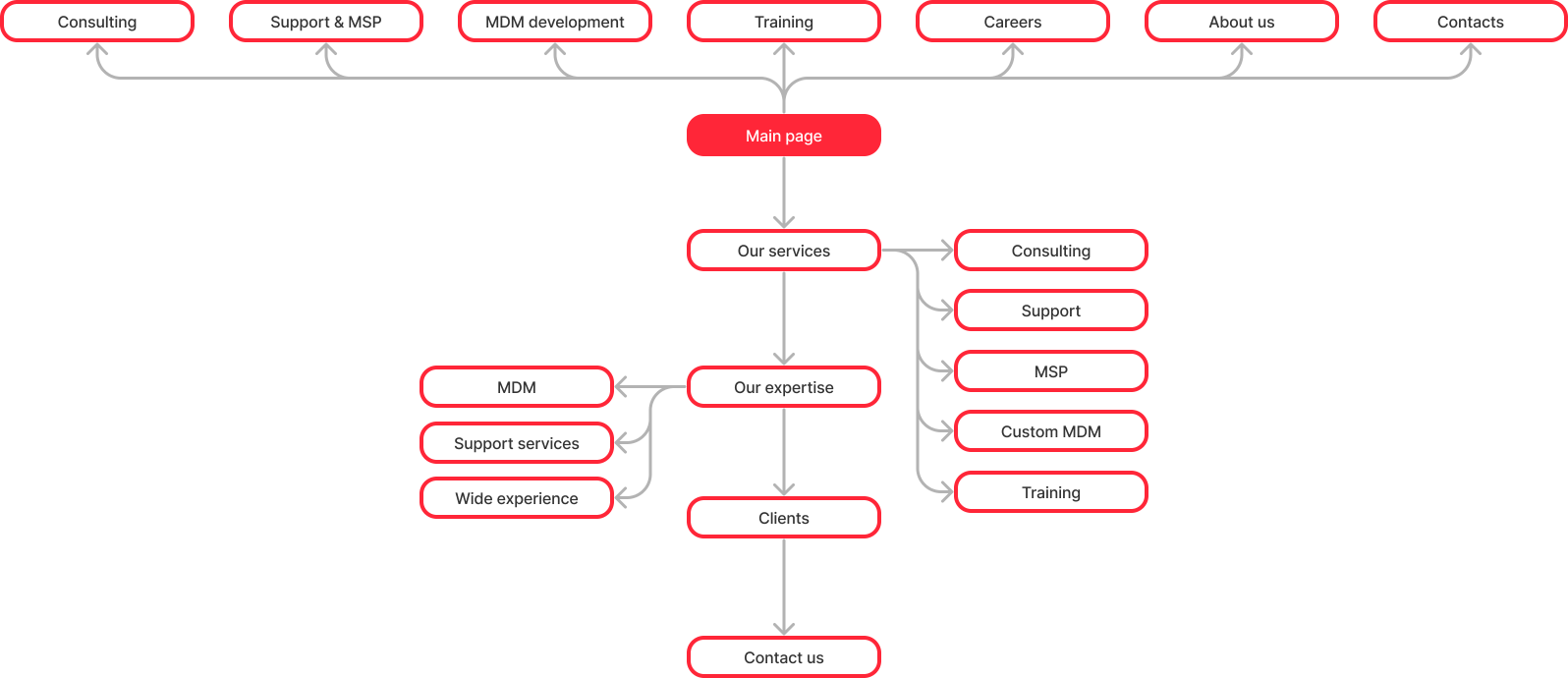
Site map


Site


Development
04
After developing the homepage and internal page layouts, we approved the design with the client and made the necessary adjustments. The next stage was the development of the website. The customer asked to build the site on tilda (no-code website builder).
In one week we managed to build a fully ready site, create adaptive versions, work out and add animation, set up primary seo for further promotion, connect all feedback forms, links, and also monitored its performance.
The site conversion increased by 3.6%, the growth of applications was 150%. The site was included in the Topdesignking selection, BestCSS gallery, CSS Light and Design Nominees, received good marks for both design and development.


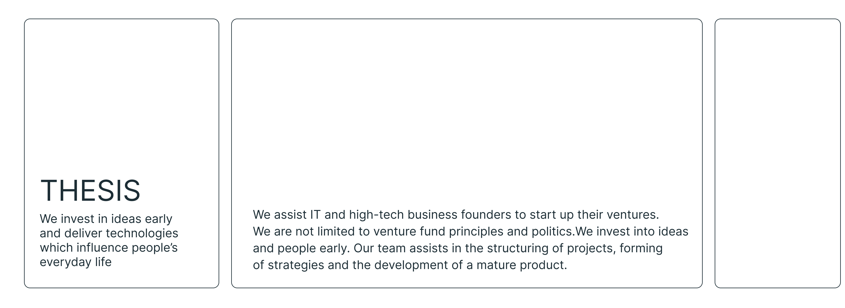
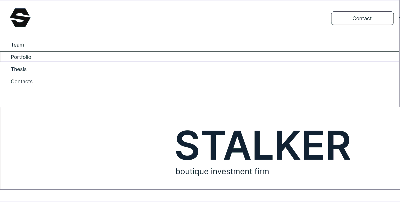
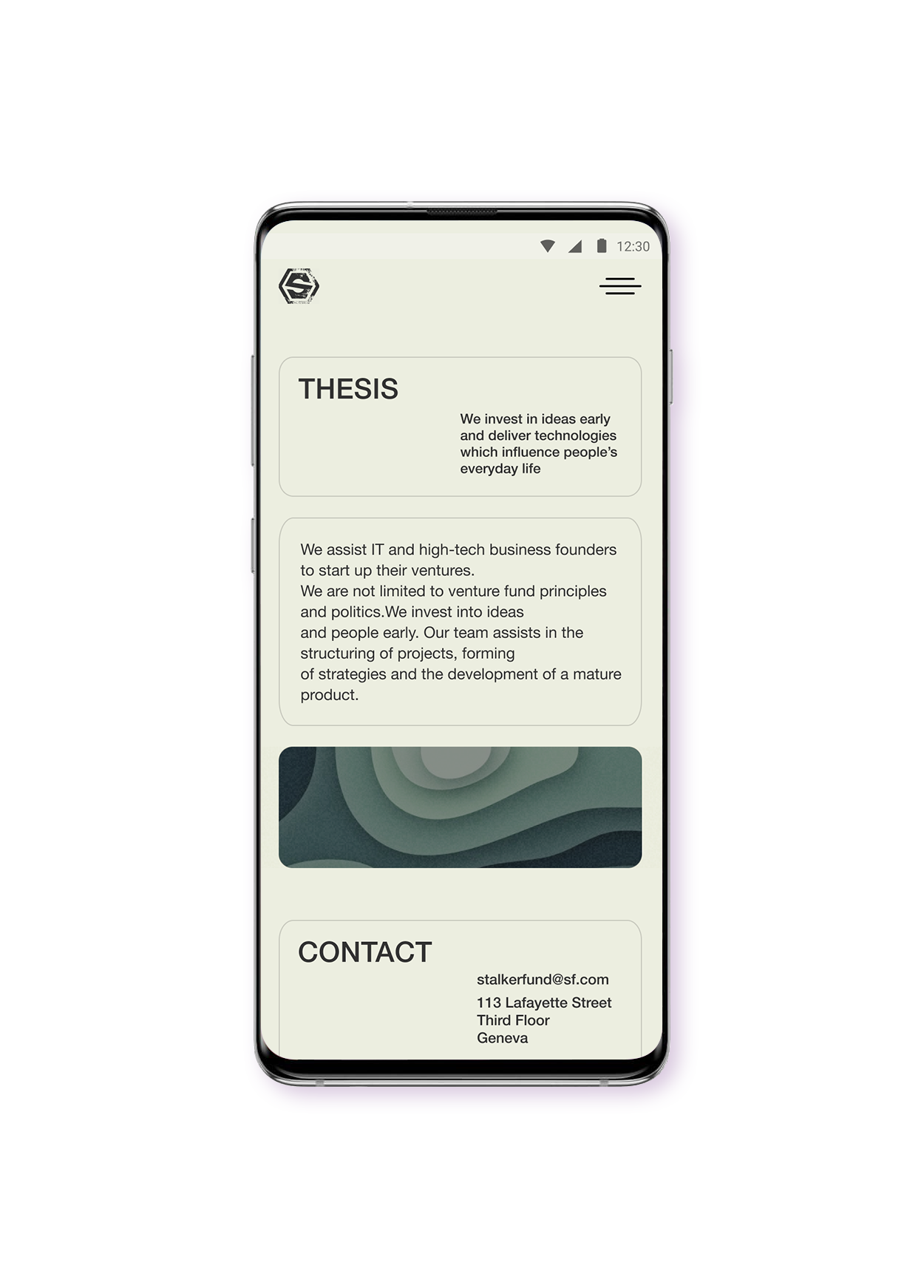
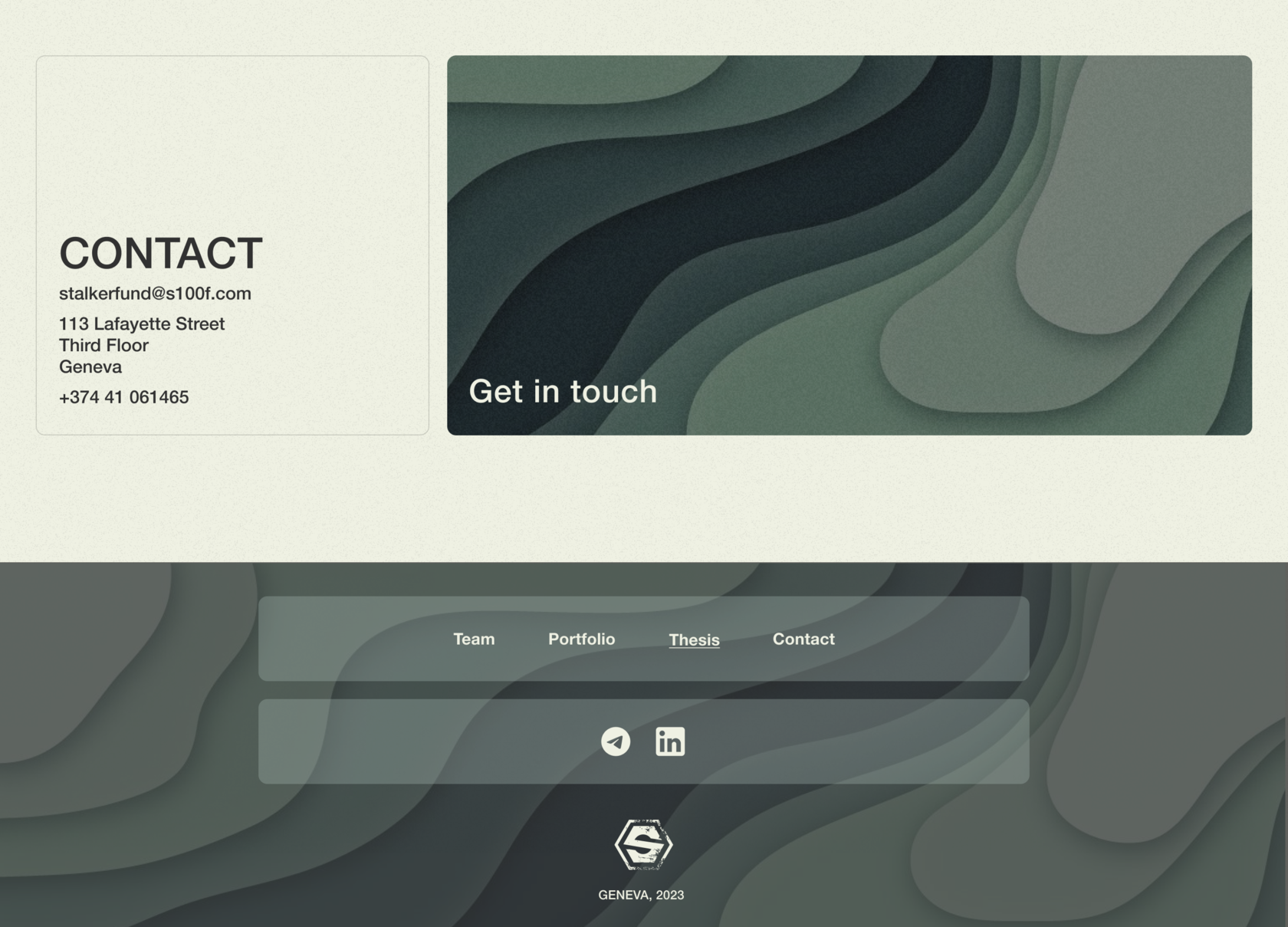
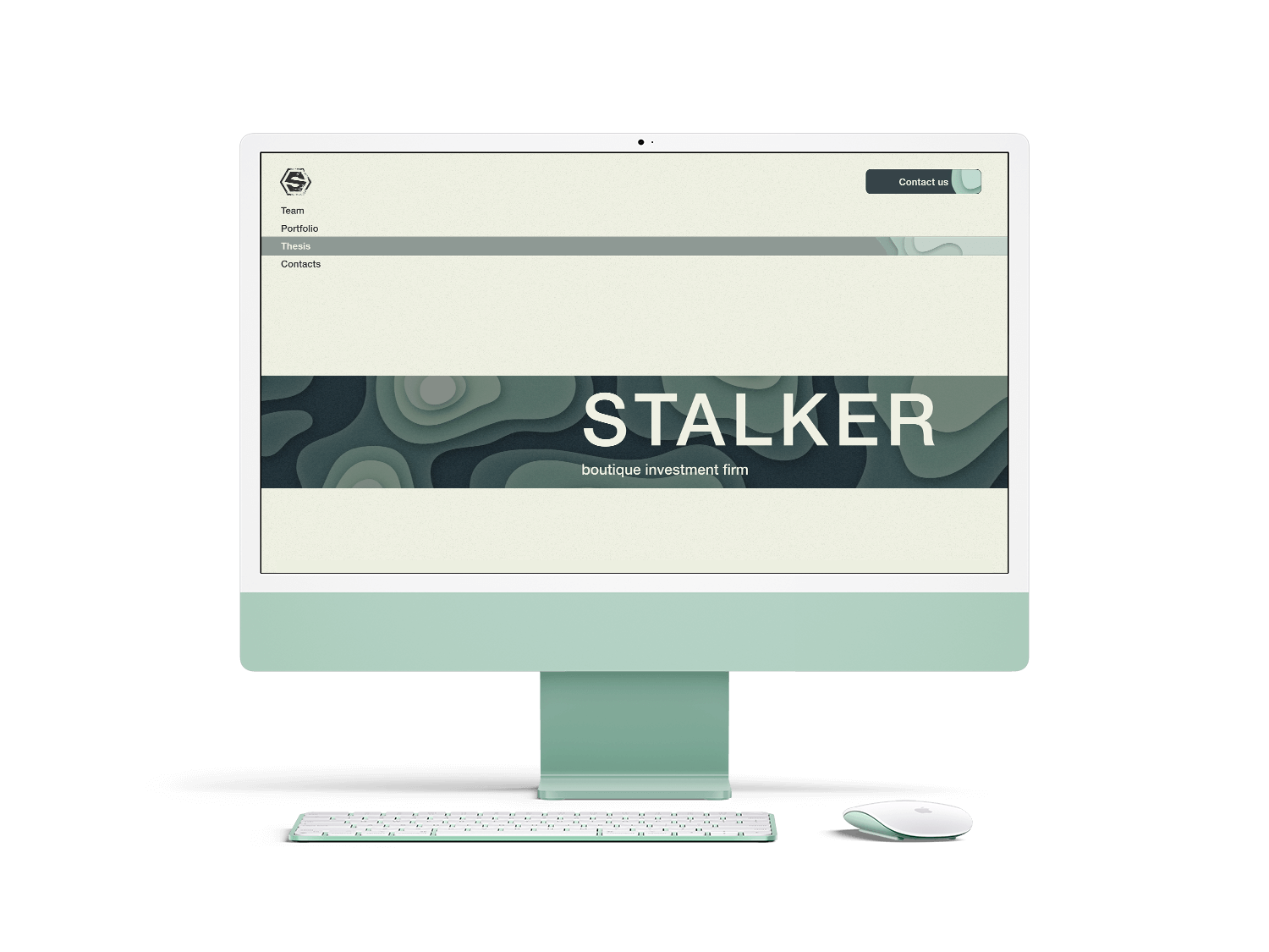
One of the projects was the redesign of the investment fund’s website. The company already had a website, but the UX-metrics were showing poor results:
Time on site — users spent a sufficient amount of time on the site, but not because of interest, but because of complex navigation and a large number of illustrations that created "visual noise", which made the site more like an artist’s portfolio;
Bounce rate — a fairly large percentage of users left the site after viewing the home page.

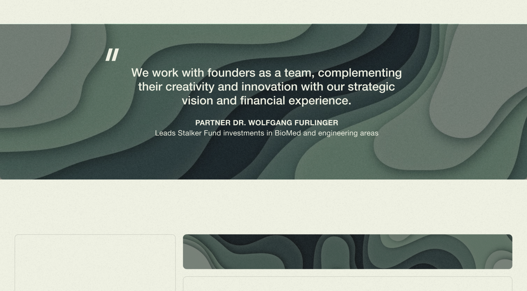
We identified several styles in which the site could be designed — bento, collage, geometric and ultra ui. After discussing all the options with the customer we decided to go for bento ui with interesting animation.
Research
01
Design
02
Prototypes
03
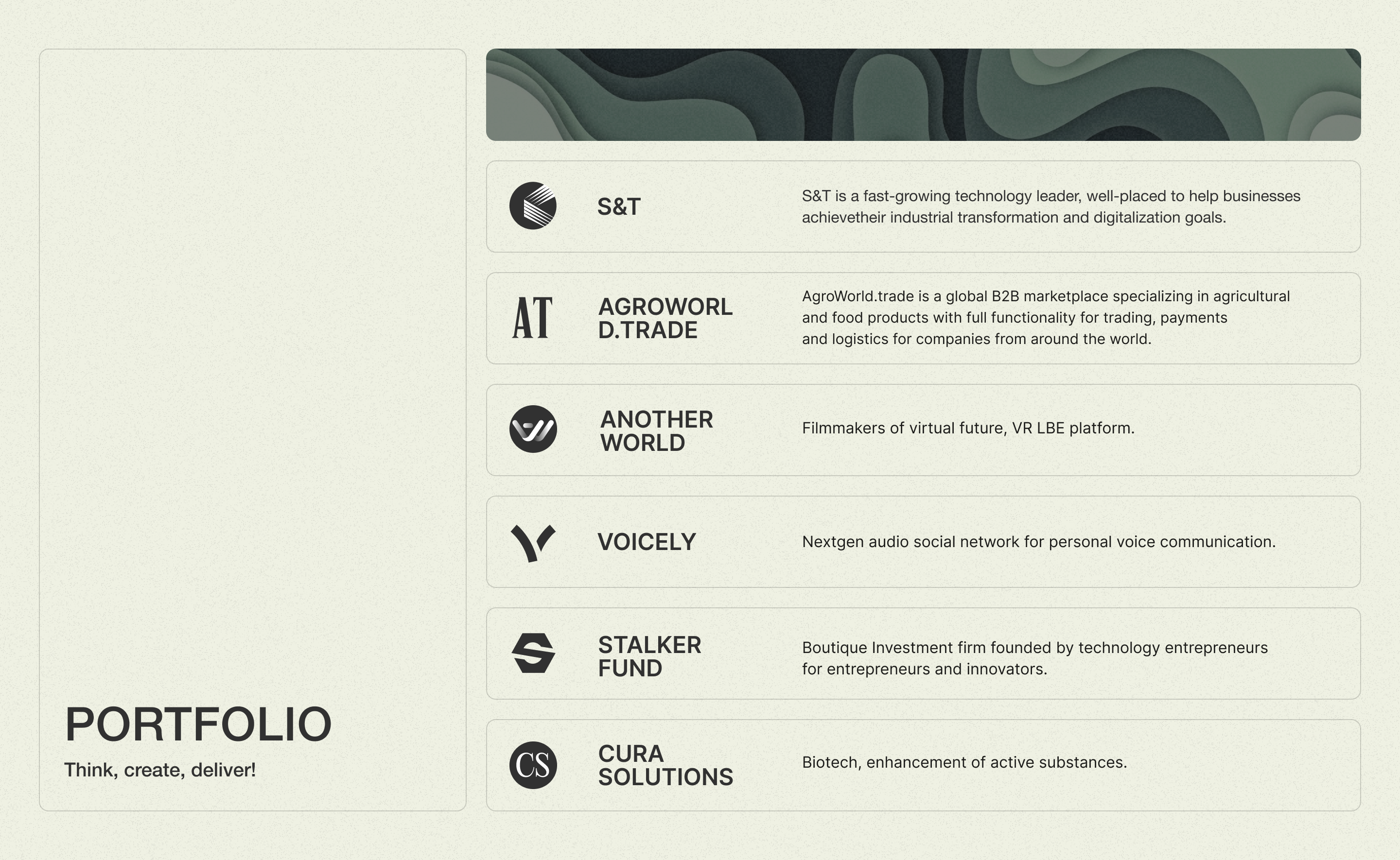
Thanks to cooperation we managed to create prototypes and understand the directions of scaling the site, adding to the site information about investment opportunities, advantages of investing in the fund. As well as launch a blog section on the site, which could be updated with relevant information about the latest events and successes of the fund.
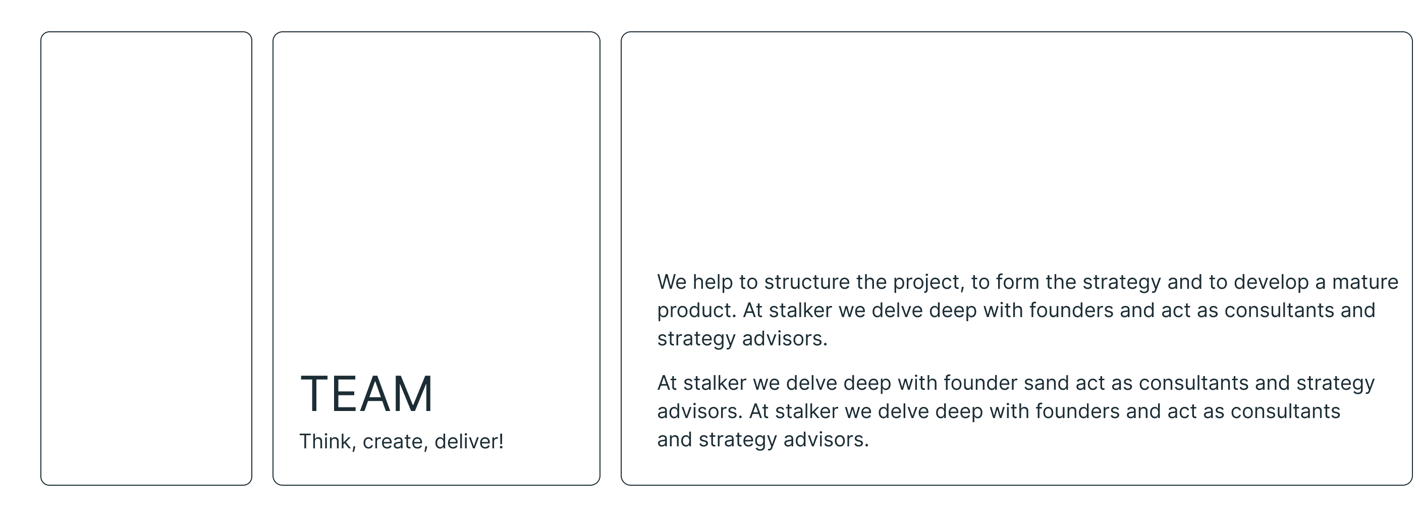
In this project, we worked in conjunction with a business analyst, project manager and developers.
We identified the target audience and their expectations from the site, studied competitors' sites and identified their strengths and weaknesses. We identified the need to make feedback forms more accessible, add testimonials and quantitative results of the fund’s work to the site. Replace colourful illustrations with minimalistic geometric ones, with an emphasis on motion design. It was also required to involve a copywriter in the development.
Competitors

There were also problems with adaptive design and copywriting errors. Thus, the audit of the existing site allowed us to identify the weaknesses of the site, identify areas for improvement and provide a better UX.

The colour palette was chosen by the customer.

Colours and font

Wireframes

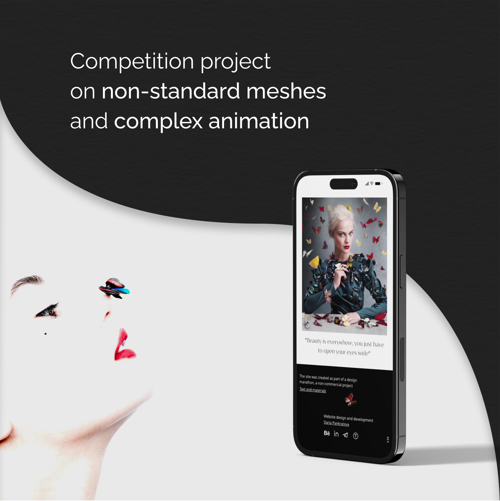
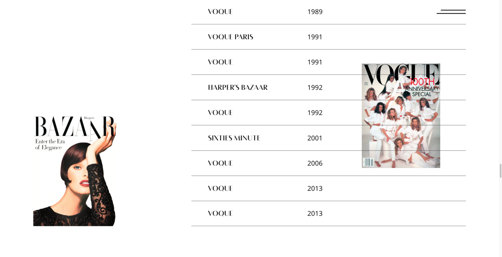
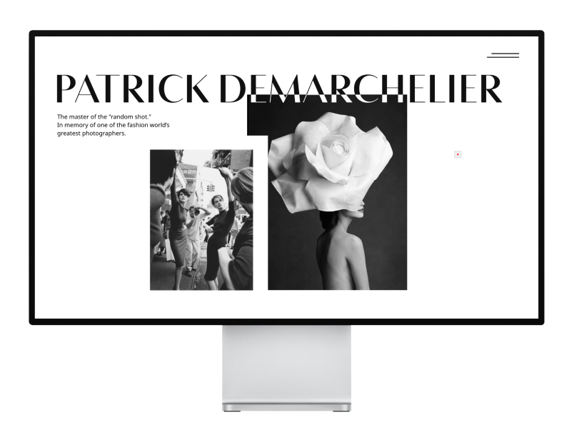
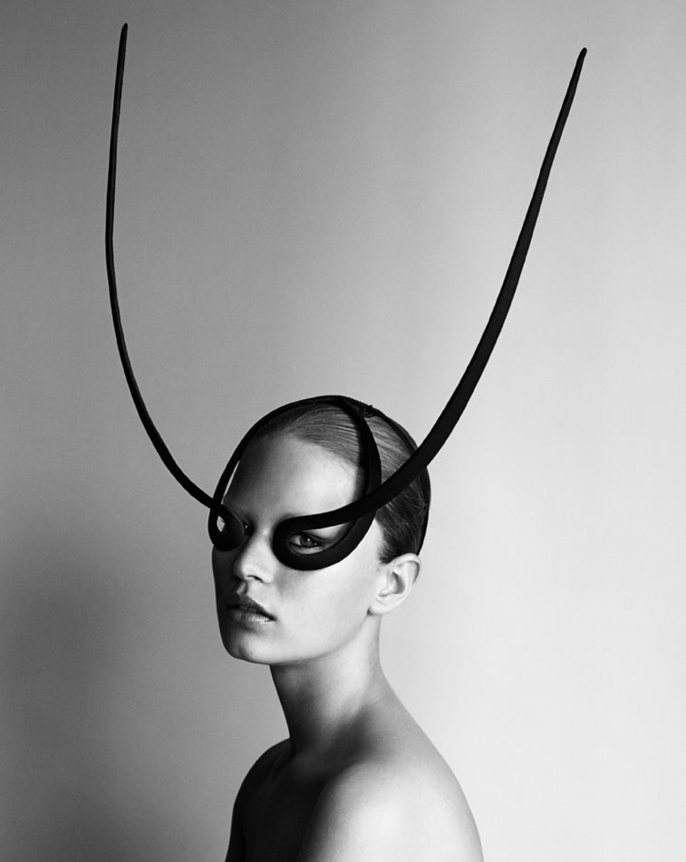
When I was training in custom animation for the Tilda website builder, I created a project dedicated to my favourite fashion photographer Patrick Demarchelier. It’s a contest project that made it into the Topdesignking, BestCSS, CSS Light and Design Nominees galleries.
Design
01
I decided to make the project in minimalistic black and white style, adding some accents in the form of a red camera focus point for the cursor, flying butterflies from Patrick Demarchelier’s photo and covers of fashion magazines for which the photographer took photos.
The animation that I decided to add to the site I would call a magazine flipping animation — the photos and their captions open smoothly one after another. And the final block with butterflies uses scroll animation.
Grid
Site


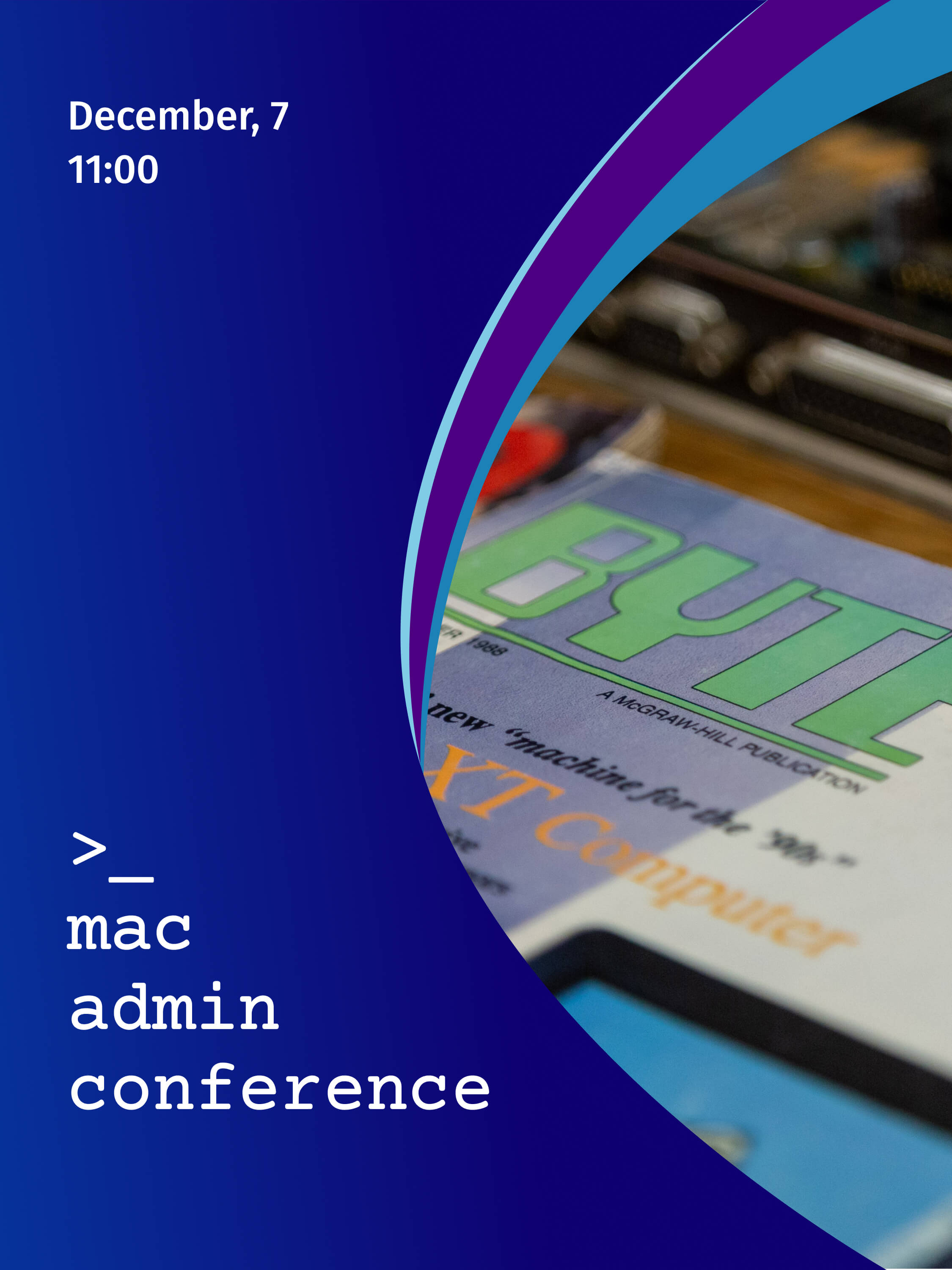
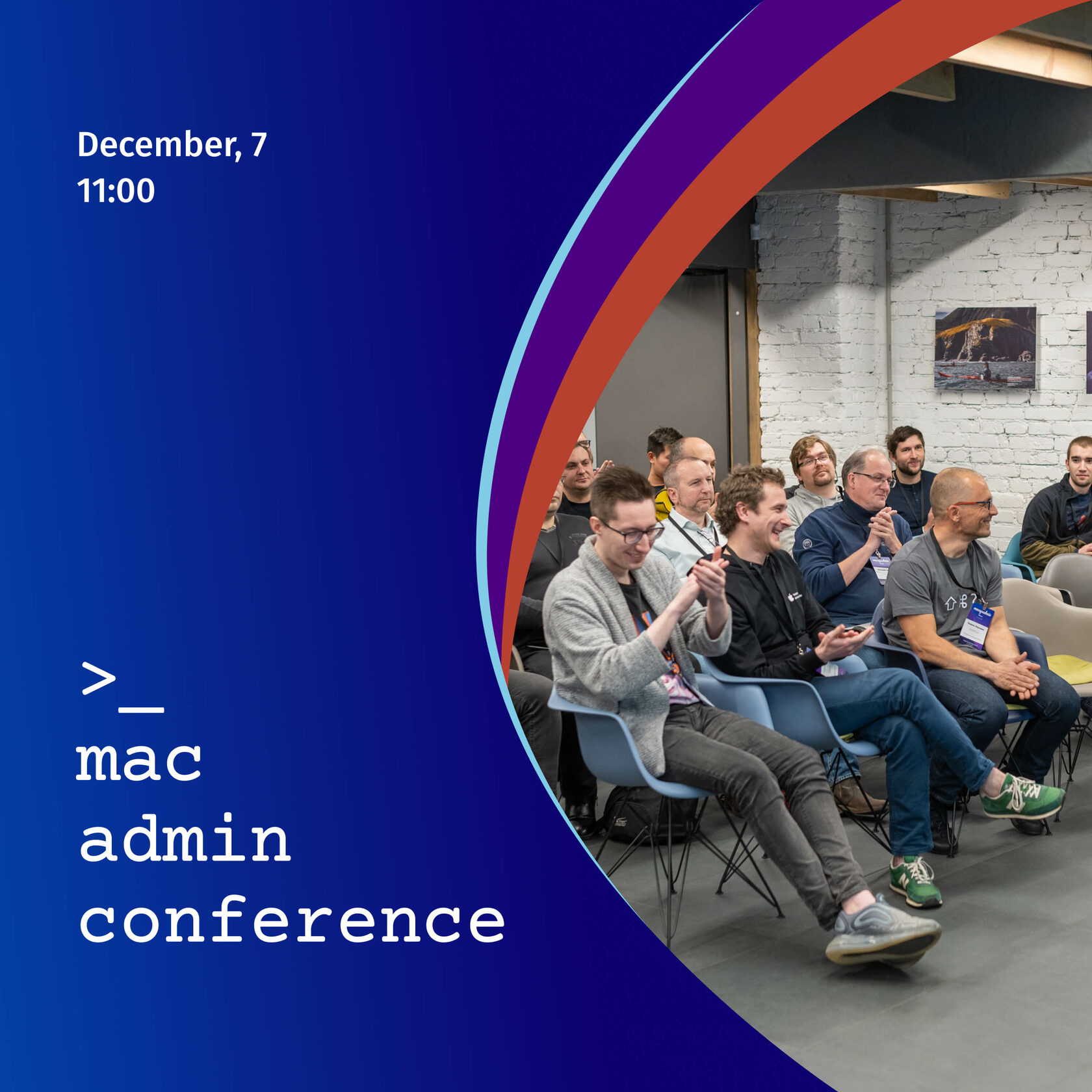
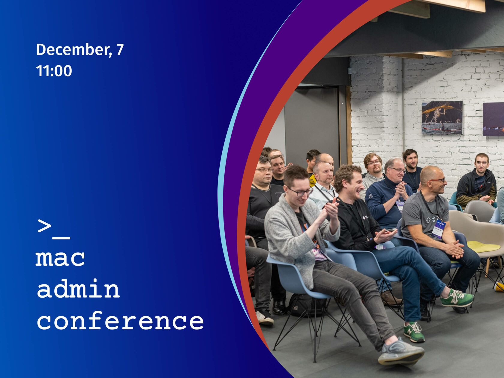
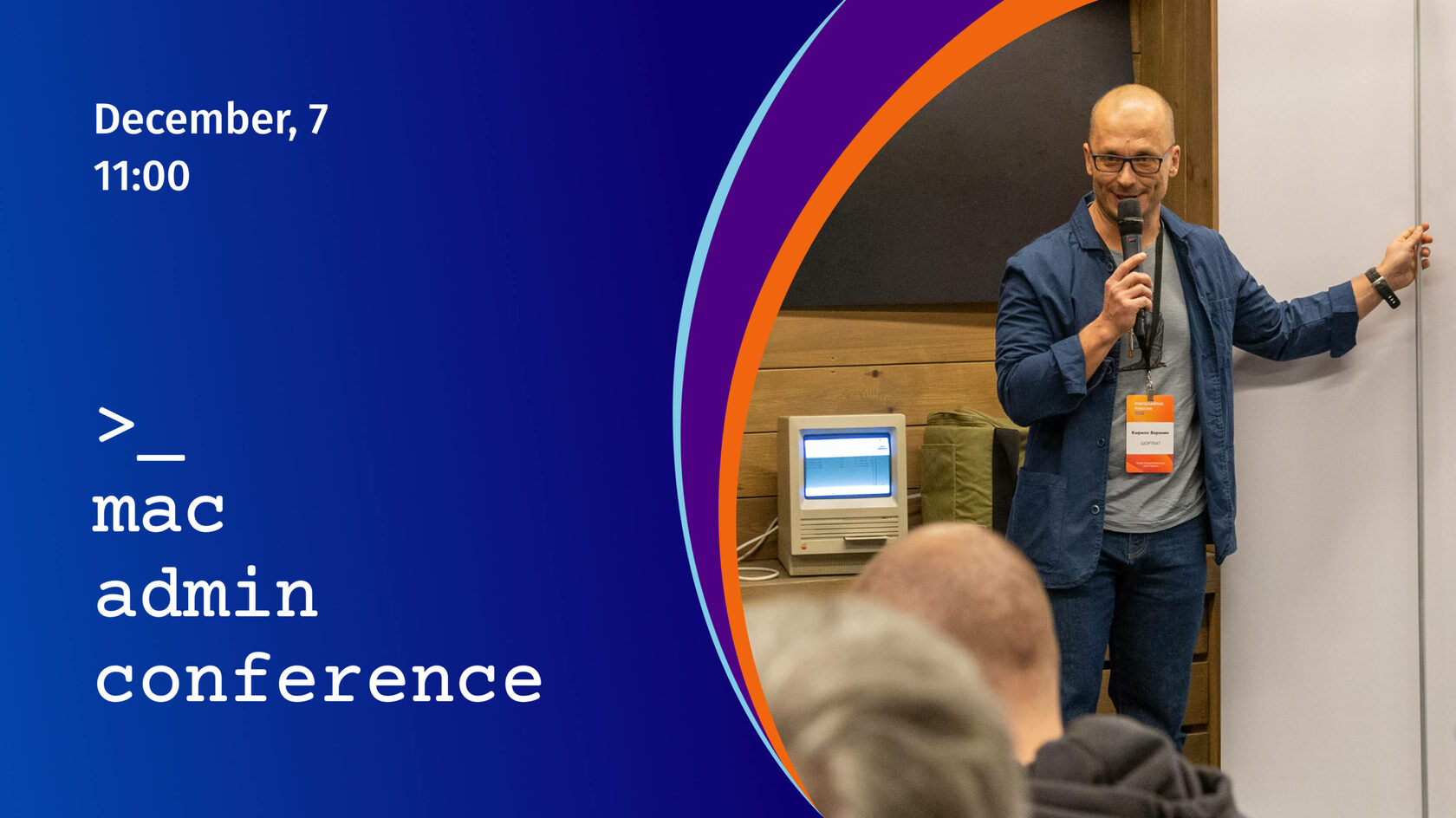
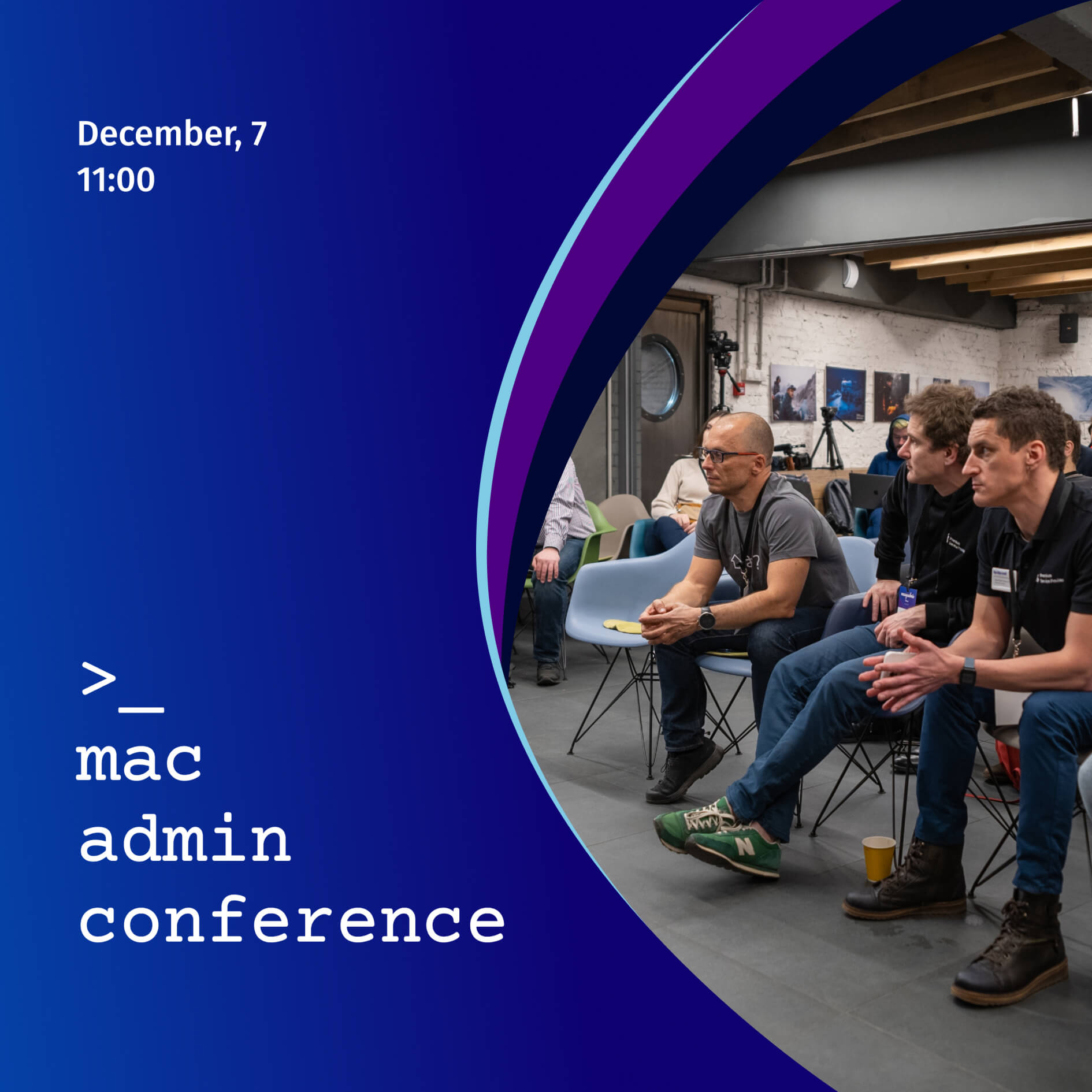
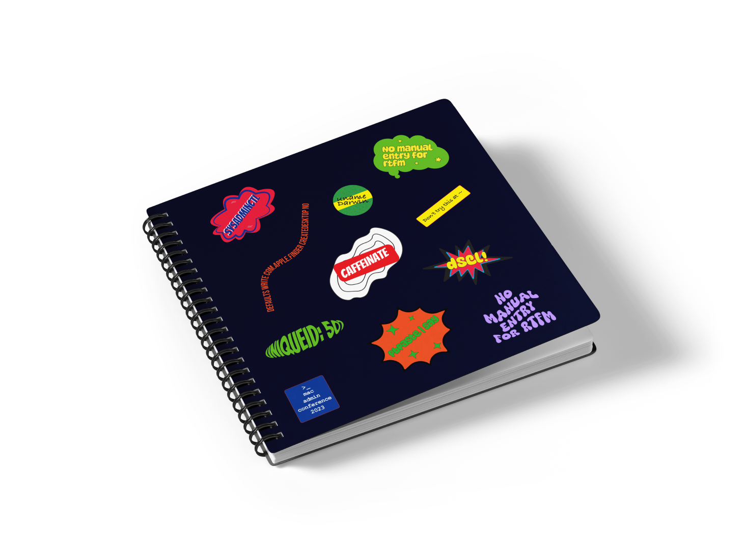
In 2024, I developed promotional materials for a conference of system administrators held in Moscow. They included 30 variants of banners for different advertising platforms, as well as a commemorative set of stickers. The development took 2 days.


Banners
Stickers

linkedin
behance
Content Oriented Web
Make great presentations, longreads, and landing pages, as well as photo stories, blogs, lookbooks, and all other kinds of content oriented projects.
